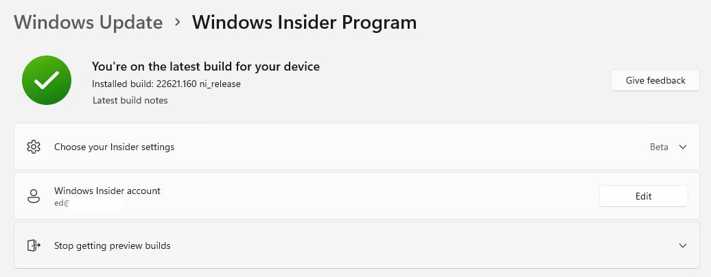
Upon visiting the Windows Insider info page in Settings → Windows Update → Windows Insider Program, I just noticed some interesting changes. That’s right: there, the Windows Insider Page gets new look. You can see what’s up in the lead-in graphic. First, there’s a link to “Latest build notes” (very handy). Second, information labels the insider account in use (I blanked it out on the screenshot). Third, there’s clear status info available. In this case it reads “You’re on the latest build for your device.” Good-oh!
Why Is Windows Insider Page Gets New Look Nice?
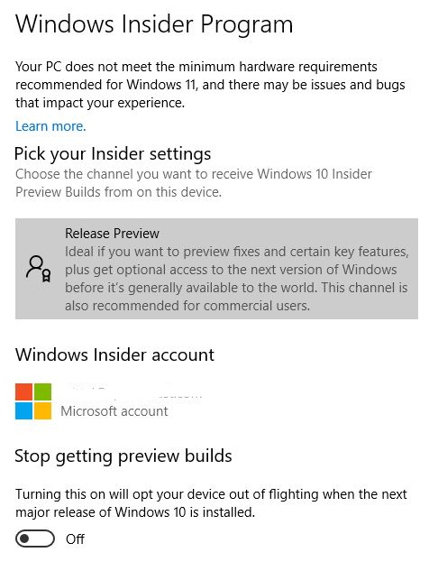
Upon checking Dev Channel Build 25140, I see the exact same look and feel there also. Going back to the Release Preview on Windows 10, however, shows the old look and feel is unchanged there.
Windows 10 Release Preview Insider Stuff remains unchanged.
In general, I prefer the new “dress” for the Windows Insider stuff in Windows Update in Windows 11. The info is more readily accessible, more compact, and more usable. I especially like one-click access to the release notes for the latest build. Checking those notes, I don’t see any info about changes to the Windows Update and Windows Insider program pages in Settings. Kind of makes me wonder how long this has been going on without my noticing.
Sigh. That’s the way things go in Windows-World — for me, sometimes, at least. Good changes can happen, but they don’t really hit home until they’re noticed. Hopefully, this notice, however late, remains welcome to you, dear readers. Sigh again…

