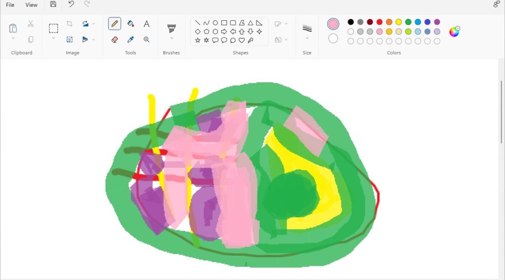
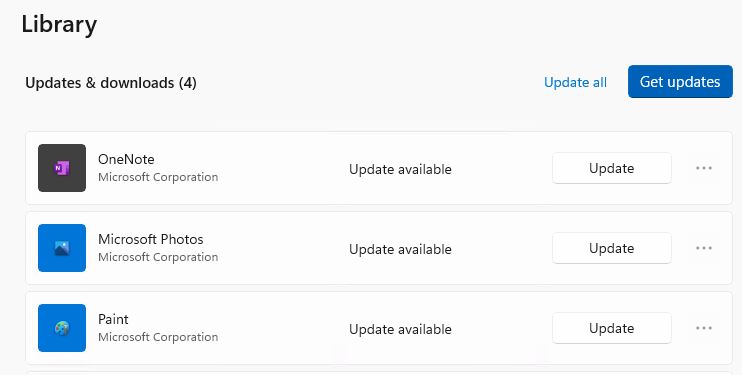
As soon as I read about it online at WinAero, I jumped into the Store to visit Library → Updates on one of my two Dev Channel PCs. And indeed, a new version of Paint awaited me there. One quick update later, and I saw for myself that Windows 11 gets nifty new paint app. My quick scrawl appears on the canvas in the lead-in graphic for this story, and the update offer in the screencap that follows.
The latest Paint version gets a Windows 11 style makeover.
[Click image for full-sized view.]
MS Store Update Means Windows 11 Gets Nifty New Paint App
If you look at the lead-in graphic for the story you’ll see right away that Paint has had a thorough makeover. The top-line ribbon features new-style icons and controls. The Colors elements are all in circular — not rectangular — swatches. There’s not much new inside, except for the Text tool (upper right corner under the Tools heading). But the new iteration is cute, fun to look at, and as easy to use as ever.
Behind the scenes, though, there’s still some catching for Microsoft to do. The “Editor Colors” window remains unchanged with square outlines around basic and custom color areas.
The base app has been reworked, but the color palette hasn’t caught up yet.
[Click image for full-sized view.]
So far, it looks like the new Paint version is off to a good start. I’ll be curious to see how this unfolds as October 5 comes and goes. Some of the necessary catch-up work looks likely to come after that, based on what I see right now. But, as usual, time will tell — as will the contents of next Tuesday’s public release. Stay tuned!

