OK then, I’ve got different behaviors in the clean install version of Build 22598 (one PC) and upgraded versions (two PCs). The lead graphic shows my post at ElevenForum about this phenomenon, and includes the different icon styles I’m seeing. One version, I’ve learned is called “combined icons” (I refer to them as “expanded” in my post) and the other “uncombined icons” (ditto for “compact”). The guru consensus at ElevenForum is that there’s a possible A/B icon test in Dev Build 22598. Makes sense to me!
What Possible A/B Icon Test in Dev Build 22598 Means
Simply put, it would mean that some machines would manifest “combined icons” while others would show “uncombined icons.” That is what appears to be up. But the announcement post, and its subsequent revisions for .100 and .200 CUs make no mention of such. I’m puzzled.
What is clear, however, is that I can’t find any Taskbar personalization control that lets me turn this feature off (or on). So I’m hoping I’ll find a registry hack to let me take control. We’ll see.
The Mystery Continues . . .
If you take a look at the ElevenForum post on this topic, you’ll see nobody in the community knows what’s up for sure. The A/B test scenario, however likely, is sheer speculation. That said, I have no better explanation.
Stay tuned. I’m casting my inquiries broader afield. If I learn something worth adding, it’ll show up here. If not, we can all keep wondering what’s up. It’s good exercise!
[Added Late Afternoon April 19]
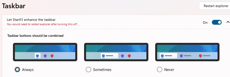
Turns out it was Start11 working behind the scenes that caused this issue. I also had the combined terminology completely backwards: combined means no accompanying text, never combined means always accompanying text. Here’s the setting I changed in Start11 to fix my issue:
 Once I selected “Always” for combined, I got the streamlined compact icons I was looking for. My profound thanks to Shawn Keene, fellow WIMVP, who pointed me in exactly the right direction. Fixed!