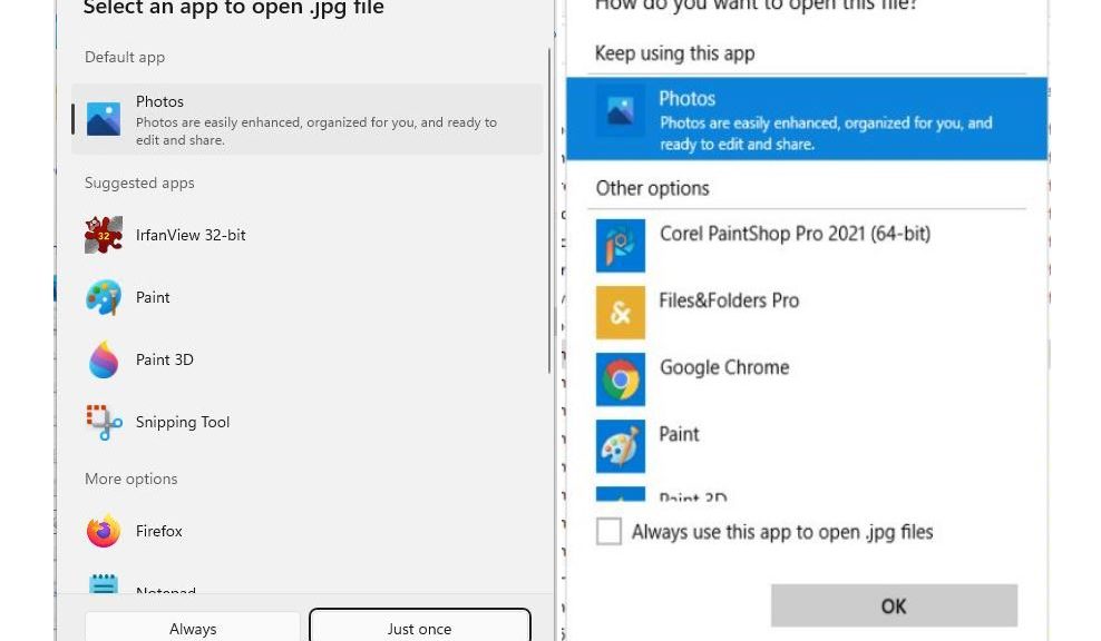
According to the 22567 announcement, the Windows team has “updated the ‘Open with’ dialog to use the Windows 11 design principles…” In case you’re not 100% sure what that means I’ve included a side-by-side comparison as the lead-in graphic for this story. Windows 11 “Open with” is on the left, Windows 10 on the right. This shows me (and you, too, hopefully) what has changed as Open with gets 22567 makeover.
What Open With Gets 22567 Makeover Means
There’s a lot to like about the new look. First and foremost, it shows the file extension under the gun. I really, really like the first line that reads “Select an app to open .jpg file.” I also like the more compact, fluid layout which shows more options, more easily. The “always use” control is a little more intuitive (as is the “just once” option).
Good stuff, in fact, all the way around. Though such improvements may seem minor or negligible in and of themselves, I see lots of improvement in the Windows 11 UI. To me, working with the new OS is getting increasingly familiar, but also increasingly fun and more intuitive. My hat’s off to the development team and its ever more compelling and interesting efforts.
Nay- and Doom-sayers, Look Out!
It’s always interesting to see the vituperation and scorn that some users heap on Windows 11. Indeed, as I see on both TenForums and ElevenForum (both of which get plenty of comments about Windows 11), a great many users are “NOT HAPPY” with the new OS. Apparently, there’s a lot not to like about Windows 11 from their points of view. That said, I’m puzzled and bemused by such reactions. Personally, I am learning to prefer and appreciate Windows 11 over Windows 10. As far as I can tell, Windows 11 just keeps getting better and better.
I wonder what explains the difference(s) between my take and that of others less intrigued with the new OS? I bet lots of folks at MS would like to know what causes such divergent reactions, too!
