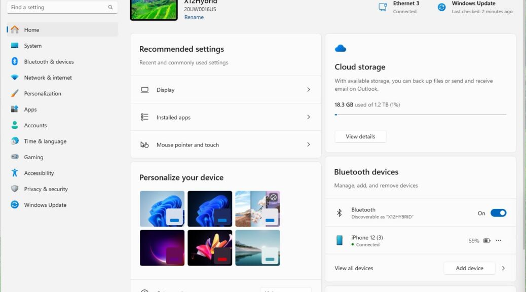
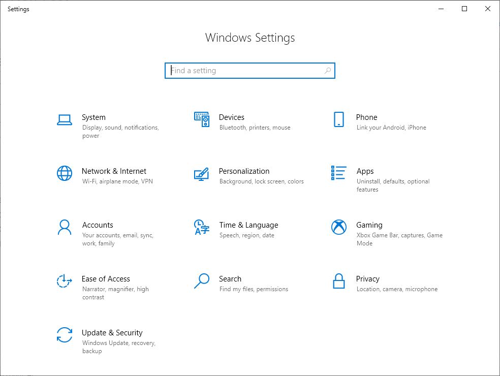
With the latest Canary build (Windows 11 23H2 25967.1000) we see a new Home pane for the Settings app. This new Windows 11 Setting home is hugely different from Windows 10 (see below). But those keeping up with ongoing updates to production 11 won’t see much difference.
Windows 10 Settings home is a simple icon table.
What About New Windows 11 Settings Home?
Compared to older production versions, there’s a little more graphics pop (certainly, it’s a lot more visually appealing than Windows 10, to be sure). But MS has been backing these changes into current 22H2 versions as they introduce them in Insider Previews labeled 23H2 as well. That makes it a little harder to tell exactly what’s what.
So I’ll turn to the Canary Channel 25967 release announcement for clarification. Here’s what it says:
We created interactive cards that represent various device and account related settings, grouped by commonly accessed functions. Each card is optimized to offer the most relevant information and controls at your fingertips. In this release, you’ll see up to seven cards, with more coming soon.
Here’s an overview of each card:
- Recommended settings: This card adapts to your specific usage patterns, providing timely and relevant settings options. It’s designed to streamline your settings management and save you time.
- Cloud storage: Gives you an overview of your cloud storage use and lets you know when you’re nearing capacity.
- Account recovery: Helps keep your Microsoft account more secure by helping you add additional recovery info so you never get locked out of your account, even if you forget your password.
- Personalization: Brings customization to the forefront by offering one-click access to update your background theme or change your color mode.
- Microsoft 365: Provides a quick glimpse of your subscription status and benefits, along with the ability to take some key actions right in Settings instead of going to the web.
- Xbox: Similar to the Microsoft 365 card, you’ll be able to view your subscription status and manage the subscription from the Settings app.
- Bluetooth Devices: To simplify your Bluetooth device management experience, we’ve brought this to the forefront so you can quickly access and connect to your favorite Bluetooth-enabled devices.
You can take swift actions directly from this page with just a click, making device and account management seamless and efficient. What sets the homepage apart even further is that it’s more than just a landing page—it evolves and learns with you.
Overall, I like the design and layout. It certainly shows and does more than the “icon directory” model for Windows 10. But with other Windows 11 versions either already in synch or catching up soon, it’s not as much of a surprise as I was expecting.
Who knows? Maybe that’s a good thing… I’ll be watching to see how Windows 11 learns from my behavior and usage to make changes. There may very well be some surprises — hopefully, good ones — in that mix. Stay tuned!

