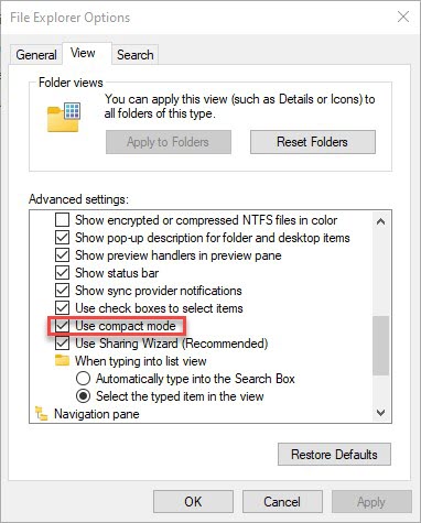
If you’re using an Insider Preview at Build 21377 or higher, you have access to a nice new view tool in File Explorer. It reduces the spacing between entries in File Explorer views, so you can see more in the display area. The more expanded view is now the default, to make it easier for touch access and control. But if you’re like me, you’re mostly still using a mouse and keyboard. In my book, that makes compact mode great new explorer control for most of my usage scenarios. The item is checked and outlined in red in the lead-in graphic for this story (above).
Why Say: Turning on Compact Mode Great New Explorer Control?
Open up the control panel utility named File Explorer Options, click the View tab, then scroll down until you can see the Navigation Pane folder. The Use compact mode checkbox appears 5 lines above. If you open both Explorer and this utility at the same time, you can see for yourself how it affects the various File Explorer views (icon based by size, Tiles, List, Content and Details).
Open a View, click the checkbox by Use compact mode, then watch how it affects File Explorer. Uncheck the box to see what wider spacing means in each view. To my untutored by experienced eye, it looks like I can see about twice as many entries in compact mode as opposed to regular mode. My strong preference is for compact mode, and it’s something I set on all new Insider Preview installations.
Not at Issue in 20H2 or 21H1, Earlier Builds
This new spaced-out version of File Explorer only affects Dev Channel builds at present. You won’t see a “Use Compact Mode” option in those older incarnations of Windows 10. Thus, there’s no call to mess with a default that’s not there, either. For those of you not using Insider Previews, then, file this for possible future reference. Cheers!
