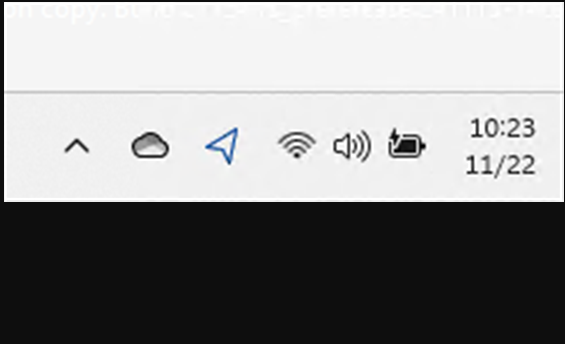
Every now and then, Microsoft likes to mess with Windows desktop display stuff. Today’s case in point come courtesy of Windows 11 Canary Build 27754, installed two days ago. In this go-round, Canary compresses date/time layout at the far right of the notification area. You can see its incredibly brief form: 10:23 above, and 11/22 below in the lead-in graphic. Does that mean I have to like it — or even want like that? Heck, no. If Canary compresses date/time layout on its own recognizance that gives me cause to report here, and remonstrate elsewhere.
If Canary Compresses Date/Time Layout, Then?
Based on my attempts to reformat the date from its current minimalist form to something a bit more informative, neither Settings > Time & Language > Language and Region nor Control Panel > Region > Date and time formats exercises any obvious effect on its appearance. I filed a Feedback Hub request to ask them to allow the prevailing settings to work rather than changing them independendly. Sheesh!
If you want to upvote my Feedback Hub suggestion, see it at Notification time/date in Canary Build 27754. TIA.
The More Things Change, the More They Stay the Same
I’m not sure why MS rearranges things at its own whim, or for reasons not fully understood, explained, or immediately obvious. But it happens from time to time. Looking at the 27754 announcement, MS has this to say:
You can revert to the long form of the date/time and bell icon visuals by toggling the values in the Settings via Settings > Date and Time under “Show time and day in the system tray” and Settings > System > Notifications under “Notifications”.
Then I found it: there’s a down-caret for a dropdown menu on the “Show time and date in the System Tray” entry in the “Date & time” section. If you open that dropdown, you can switch back to long-form displays. Here’s what that looks like:

As you can see, I clicked the entry “Show seconds…” Once I did that the time then displays as 11:15:27 AM and the date as 2024-11-22, as per my settings. It looks like one must go the long way around to get to the right destination. That’s not a totally unexpected experience in Windows-World, either!
Why didn’t the announcement simply say, switch from Show abbreviated date and time to Show seconds in system tray…? I would’ve understood that immediately, and known exactly what to do. Sigh.
