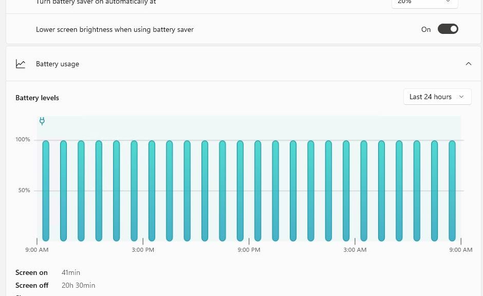
I updated my Dev Channel PCs to the latest build recently. And, as reported at WindowsLatest, the Settings app gets a few interesting new wrinkles. Chief among these changes, Build 22543 brings new Battery info into System → Power & battery → Battery. You can see for yourself what it looks like in the lead-in graphic.
The most obvious feature is a time series chart of battery levels. Mine’s a boring 100% across the board, because this test PC stays plugged in via a Thunderbolt/USB-C dock that delivers 85W of charging power. BTW, the dock also delivers multiple USB-C and USB 3.2 ports, GbE, dual HDMI, and an audio jack port as well.
If Build 22543 Brings New Battery Info, Check It Out!
While Battery & Power (shown above) is the most obvious change to settings, I see minor tweaks throughout. Fonts and layout show minor changes (check out the Display info on PCs with multiple displays). The contrasts with earlier Windows 11 versions are minor, but compared to Windows 10 you can readily see Settings is slowly but surely getting a major makeover.
FWIW, I like what I see. Overall, Windows 11 Settings screens seem cleaner, more streamlined and modern than their Win10 counterparts. Looks also like “Add device” capabilities in Settings (Settings → Bluetooth & devices → Add device) are ramping up. It’s not hard to see the old-fashioned “Devices and Printers” facility fading away in its wake.
The Increasing Pace of (Settings) Change
We’ve known for years that MS is working its way into Settings and away from the old-fashioned Control Panel. It will still be a while before that changeover is complete, but its evidence is everywhere. I hope I can learn where things are, and how they work well enough to remain productive before the old gives way completely to the new.
Whatever happens along the way there’s no doubt it will be an adventure. Stay tuned, and I’ll do my best to provide some hopefully useful info and guidance.
