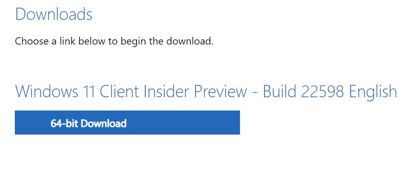
That didn’t take long. Build 22598 in the Dev Channel made its debut on April 13 (yesterday). Today (April 14) it’s already available for download on the Windows Insider Preview Downloads page. {Note: eagle-eyed reader and fellow WIMVP David H Johnson tells me the ISO and the WU version appeared at the same time.] The lead-in graphic above, shows 22598 Insider ISO download available. Of course, users must sign in with a valid Insider MSA (Microsoft Account) to gain access.
22598 Insider ISO Download Available: Grab It!
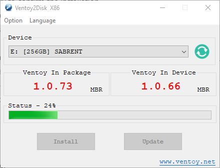
This was the source I used last weekend for the clean install on my “troubled” X380 Yoga. I ended up with an earlier version because of the timing. Nevertheless it worked like a charm. I’m in the habit of keeping ISOs together on my Ventoy drive, so I have going on 30 (mostly Windows OS) images all together on one easy-to-search external drive.
And because that drive is a USB-C/Thunderbolt 3 enclosure with a nominal 256 GB NVMe SSD inside, it does a reasonably good job of providing ready and quick access to its contents. The whole thing cost me about US$100 in late 2020 (you can buy the same thing for under US$75 now). It’s definitely proved its worth to me many, many times since I put all the pieces together (read more about its innards in this December 2020 post: Interesting Single-Builder SSD Benefits.
Doing the Download Thing
After specifying my version and language in the download GUI, I grabbed a copy of the 22598 ISO from the web page. It took about 7 minutes to arrive in toto — longer than most such transfers take me. Watching it make its way onto my C: drive, I can only speculate that traffic levels are higher than normal. Indeed a quick hop to Fast.com showed Internet speeds all over the place on my local cable loop, ranging from a low of 250 Mbps to a high of 650 on my 940 Mbps (max speed) connection.
But once you have the ISO you can use it for DISM repairs, an in-place repair install, or even — as I did recently — a clean reinstall. Handy!
