Category Archives: Software Reviews

We are constantly getting a wide variety of hardware and software to test and exercise under a range of conditions. As you might expect, some work better than others, some play nicely with others (or not), and a few are genuinely pleasant surprises. Here you’ll find a collection of reviews on a range of products. We’ll be updating this section frequently as we run across new stuff, so come back soon and often!

Stellar OST Tool Worth Grabbing


Microsoft Outlook, in both its local and cloud forms, is an interesting beast. For those with Microsoft 365 or similar subscriptions, that goes double. For such instances, Outlook uses OST (Online Storage Table) files, which maintain fluid, shared snapshots of Outlook “stuff” (e.g. messages, events, contacts, and so forth). Such files live mostly in the cloud on an Exchange server. Outlook also uses Personal Storage Tables (stored in PST files locally on a PC) as well. But while Outlook allows users to export and import from other files,  OST files won’t support this activity: PST is your best bet.

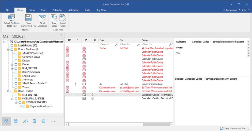
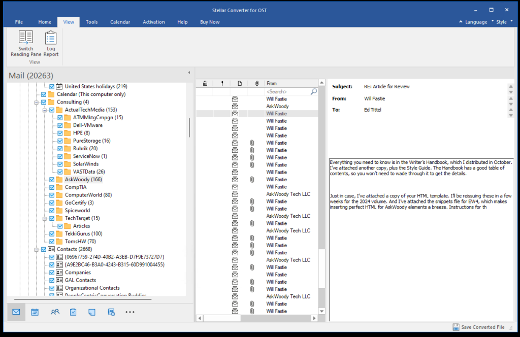
Here’s what STELLAR OST CONVERTER looks like, once you complete the initial conversion step.

Why Is Stellar OST Tool Worth Grabbing?

Simply put: the STELLAR CONVERTER FOR OST provides a quick and easy way to convert OST to PST files (local to the PC) with just a few mouse clicks. Indeed it can even recover “orphaned” OST files — those no longer readily available inside Outlook itself — by scanning folders where OST items live. It then happily converts everything it finds to PST.

Stellar OST Tool Worth Grabbing.outlook-import-export

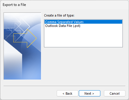
Outlook’s export/import capabilities embrace PST files, but NOT OST files.

As the preceding graphic shows, Outlook exports its contents to PST. A similar dialog for import shows those same options. OST, I’ll observe, is conspicuously absent. Thus, this tool provides a great way to create backup PST collections to match Outlook accounts and related file holdings. These can get quite large: mine is currently around 3GB in size (I’ve seen them as big as 14GB). Conversion takes awhile: about 15 minutes in all (7.5 to scan and enumerate, 7.5 to save) . That said, PST files are browsable repositories, and can restore entire Outlook data collections if necessary.

Exploring This Stellar Tool…

In graphic captioned “initial conversion step” above, you see the STELLAR CONVERTER FOR OST, showing the contents of the Consulting/AskWoody folder. As you can see, it captures all of my recent message traffic, and can show individual message contents in the reading pane at far right. The left-hand pane shows the folder hierarchy; the center pane shows message info. Note: deleted messages appear in red in their parent folders (as well as in Trash).

In fact, the STELLAR CONVERTER FOR OST offers several noteworthy additional capabilities:

  • Handles large OST files: It took about 15 minutes, but STELLAR CONVERTER FOR OST handled my huge collection of Outlook data. That included messages, contacts and calendar data . The time to scan is roughly equal to the time to save what’s been scanned.

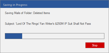
By some quirk of fate, the subject of the current message pops up as STELLAR CONVERTER FOR OST save handles Outlook message store.

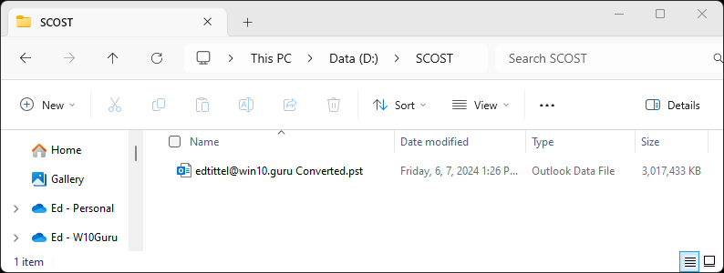
Once saved, the converted PST file weighs in at just under 3.0 GB (3,072MB).

  • Handles encrypted OST files: STELLAR CONVERTER FOR OST can read and decrypt encrypted OST files, and save them in PST format. When mailbox or server synchronization issues impede server-based decryption, STELLAR CONVERTER FOR OST delivers them in readable PST form.
  • Global purview for Outlook data files: STELLAR CONVERTER FOR OST finds and lists all OST files. That includes those from IMAP plus Exchange or Microsoft 365 message profiles. Users can easily select and scan OST files to extract specific items. STELLAR CONVERTER FOR OST also offers a powerful “Find” (search) function. It even shows orphaned messages in a Lost & Found folder, like this:

The Lost&Found folder in STELLAR CONVERTER FOR OST contains orphaned Outlook items — mostly Calendar stuff.

  • Complete OST coverage: SSTELLAR CONVERTER FOR OST extracts everything from OST files. Beyond email messages, it handles attachments, contacts, calendars, tasks, notes, journals, and more. It even handles OST to PST conversion with no need for Exchange profiles.

But Wait: Still More Recovery…

Beyond these specifics, STELLAR CONVERTER FOR OST is useful for recovering from OST synchronization failures. These can occur when

  • the client view of what’s current and correct diverges from the server’s view
  • when mailbox issues (loss, damage, corruption) present themselves
  • clients wish to recover deleted items no longer present in the Trash folder. You can see such deleted items in red in the preceding screencap (assume they’re more useful than canceled appointments, please).

OST conversion provides a PST upon which to base a new, shared view of Outlook contents and to re-establish proper agreement.

Vitally, STELLAR CONVERTER FOR OST offers recovery should the server behind Hosted Microsoft Exchange service be damaged or hacked. That is, this program can provide PST files from which to rebuild and restore mailbox data to Office 365 or Microsoft 365 servers. This same capability also enables quick migration from Hosted Exchange to O365 or M365 with minimal effort, and no risk of data loss. Good stuff!

STELLAR CONVERTER FOR OST Costs & Cons

STELLAR CONVERTER FOR OST comes in 3 versions: Corporate, Technician and Tookit, with respective licensing fees of US$79, US$149 and US$199. See their “Buy Now” page for a complete comparative features matrix. The TLDR version is that higher-priced versions offer more and better repairs: Technician adds batch file conversion, more advanced PST handling, exports to live Exchange and O365, plus Contacts in CSV format to the mix; Toolkit does all that, plus corrupt PST repairs, total mailbox restores, more format options, PST merge, password recovery, and a whole lot more. Of course, you’d expect to spend more for higher-end program versions, but they do come at higher costs.

For years, I’ve relied on Outlook to maintain a journal of all the emails I send and receive. It’s an astonishingly detailed and accurate record of my professional and financial life. STELLAR CONVERTER FOR OST provides me with the confidence that I can access and rely on my “email trail” to document and manage a busy working schedule, an upcoming calendar, and a sizable list of professional colleagues and contacts.

The more you rely on email to help run, document and prove up your activities, assignments responsibilities, and professional network, the more you need STELLAR CONVERTER FOR OST. It’s definitely worth having, if only as a way to insure yourself against loss of or damage to vital working assets.

[Note: I produced this item after Stellar contacted me to ask me to write and post the piece. I am invoicing them for a modest fee as well. That said, the opinions herein are my own, and I stand by my recommendation of this product.]
Facebooklinkedin
Facebooklinkedin

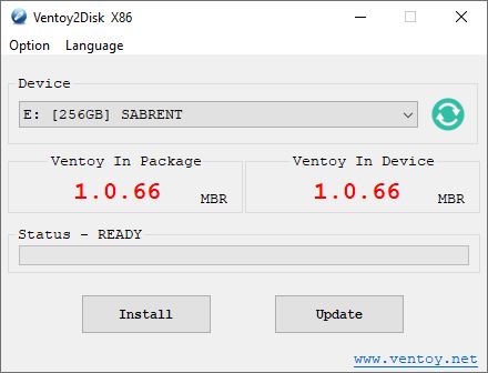
New Ventoy 1.0.66 Version Available

Thanks to Martin Brinkmann at Ghacks.net, I just learned there’s a new Ventoy 1.0.66 version available. Among other cool features, it now supports an “experimental” (beta) feature to boot most supported image formats from a local disk. Check out the GitHub page and its  documentation page at Ventoy.net for a complete recitation.

With New Ventoy 1.0.66 Version Available, Grab One!

I’ve been writing about Ventoy since April 2020, when I first learned about this outstanding tool. Here’s my first-ever Ventoy item: Bootable USB Tool Ventoy (Win10.Guru). The Ventoy,net site has long since overcome its initial underprovisioning issues. Indeed, the tool is now available through both GitHub and SourceForge as well. It’s also added lots of bells and whistles along the way.

If you don’t already know and use this tool, you owe it to yourself to check it out. Be sure to check out the many content items on the Ventoy Document page for news, how-tos, explainers, and information about the tool’s growing collection of interesting plug-ins.

Make Ventoy Your Go-To Install/Repair Tool

Right now, I’m still using a 256GB SSD in a Sabrent NVMe drive caddy (USB 3.2 Gen 2) for my collection of tools and images. I have 29 images on the drive, which include many versions of Windows 10 and 11, plus the Microsoft Diagnostics and Recovery Toolset (DaRT), the MacriumRescue ISO, BOOTPE.iso, various memtest utilities, and more.  I’ve still got 94 GB of disk space free on the drive and will no doubt keep adding to it over time.

It’s a great tool: worth downloading, using, and updating as needed. Cheers!


Facebooklinkedin
Facebooklinkedin

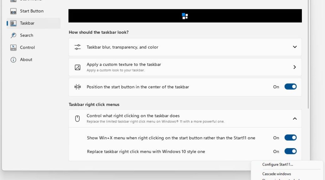
Version 1.1 Brings Start11 Way Up

When Windows 8 arrived in 2012 — a decade ago, now — I was nonplussed and flabbergasted. The new menus completely threw me for a loop. I had trouble finding my own desktop and its assets. Then I discovered Stardock’s Start8, which let me use everything I knew about Windows 7 to interact with Windows 8. It was a lifesaver. By the time Windows 10 came along, I naturally gravitated to Start10 out of habit, if for no other reason. With Windows 11, early versions of — you guessed it — Start11 had me wondering why I bothered with the program. Even for a mere US$5 ($4 to upgrade) it didn’t seem to add much to the native experience. But version 1.1 brings Start11 way up in terms of functionality, and provides one-click access to otherwise more complex native operations. Let me explain…

If Version 1.1 Brings Start11 Way Up, What Do You Get?

Take a look at the lead-in screencap. IT shows the right-click taskbar pop-up (lower right) along with the Start11 settings pane that makes it happen. The key item is “Replace taskbar right click menu with Windows 10 style one.” That change confers the following options:

  • Configure Start11…: provides instant access to the Start11 app (previous versions needed a launch from the Start menu)
  • Cascade windows/Show windows stacked/Show windows side by side: manage on-desk arrangement of open Windows
  • Show the desktop: hide all open Windows
  • Task Manager: one-click access to the Task Manager
  • Taskbar settings: one-click access to Taskbar settings

For me the biggies are easier access to Start11 controls and familiar access to Task Manager. Does this mean I’m turning into a hide-bound dinosaur, set in my ways? Probably. I had been using CTRL-ALT-ESC to fire off Taskbar before and this is less work.

Other taskbar tweaks are nice, too. They include changing its size and position (but top or bottom alignment only, no right or left side).

Worth the Price of Admission?

Sure, Start11 is cheap. But I’ve learned a lot since Windows 8 hit the streets a decade ago and more. I’m not uncomfortable in the native Windows 10 Start menu , and ditto for Windows 11. I’ve got several test machines running 11 with no “menu support” of any kind and am just as productive there as on an assisted alternative desktop.

I’ll probably buy a license for Start11 when I upgrade my wife’s 11th-gen Dell Micro 7080 later this year. She will be able to keep working as she always has, with little difference between how her system now works on Windows 10 and how it will work post-upgrade. But outside those who resist, or don’t like, change, I don’t see Start11 as a must-have piece of software any longer.

Does that mean Microsoft has gotten better at building base level OS navigation? Or does it mean that I’ve simply absorbed the start menu ethos within Windows 10 and 11? A little of both, I suspect.

Bottom line: If you’re already using Start 11, the 1.1 upgrade really makes the program shine (and more usable and capable). If that means you, grab the upgrade today!


Facebooklinkedin
Facebooklinkedin

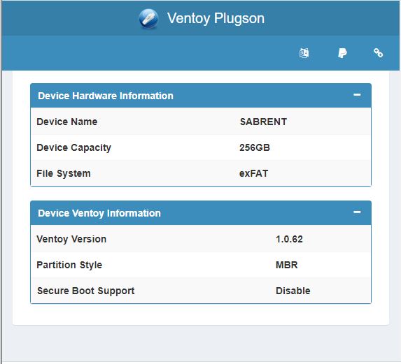
Ventoy 1.0.62 Gets Plug-in Manager

I’ve been a huge fan of the Ventoy bootable image tool for several years now. The developers have recently released a new 1.0.62 version at GitHub. It includes a GUI plugin configurator that immediately explained to me why I have issues with my current version on some of my laptops. The partition style on the ventoy drive is MBR and some of my newer laptops are GPT/UEFI only. Thus, when Ventoy 1.0.62 gets plug-in manager, I get ready information to helpful details right away. Cool!

If you’re not already familiar with Ventoy, it includes two partitions on USB attached storage media. The bulk of the device is exFAT formatted, and provides storage for ISO, WIM, VHDX, and other mountable cabinet or image formats. The VTOYEFI partition (32 MB FAT) has just enough smarts to get the PC running, mount an image, and then pass boot control over to that image. The result is a way to store all of your Windows (and other OS) images in one place, along withe repair tools, and boot into them as and when you need to.

If Ventoy 1.0.62 Gets Plug-in Manager, Then What?

Why, download and install if you’re not already using the tool. Or download and update if you already are. The Plugson GUI manager is a major step forward in functionality, visibility and insight, and improved control over the program. I’m not sure I understand all the wrinkles just yet. Thus, I plan on writing about it again after some more time spend fooling round … err … experimenting with its features and functions.

The more I look at plugson the more things I find to like about it. This program has evolved considerably over the three years or so it’s been available. And it just keeps improving and extending what it can do. Good stuff, and a great tool for Windows admins and enthusiasts.

Facebooklinkedin
Facebooklinkedin

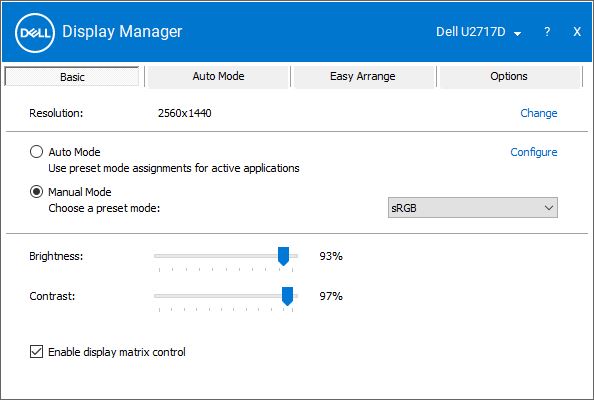
Dell Display Manager Pops Outta Nowhere

OK, then. Yesterday, I fired up a local account on my production PC while investigating the new Firefox Store app’s behavior. When I did so, that account asked me if I wanted to install Dell Display Manager. That explains this story’s title: Dell Display Manager pops outta nowhere. I’d never heard of it before, nor seen it mentioned in other Dell apps. (For example, Dell Update Control or Dell Support Assistant, both familiar because the Dell Optiplex 7080 Micro that’s a family daily driver PC at our house.)

Good News When Dell Display Manager Pops Outta Nowhere

“OK,” I said to myself, “let’s give this a shot.” That turned out to be a good move. It’s kind of a pain to use the monitor’s own built-in control buttons to manage brightness, contrast, color profiles and so forth. The Dell Display Manager (which I’ll call DDM going forward) does all this on the Windows desktop. Much, much easier and more user-friendly.

My only question is: Why hadn’t I heard of this tool sooner? As a regular at TenForums and ElevenForum, people talk about monitors a lot. And some of those folks are also MVP-equivalent on the Dell forums as well. Yet I managed to remain not-so-blissfully unaware of the tool until now. And to think I’ve been buying Dell monitors since the mid-to-late 1990s!

If You’ve Got Dell Monitors, Use DDM

The home page for the utility includes  a download link for the tool. It’s entitled “What is Dell Display Manager?” and provides a useful and informative overview of its capabilities. As the page says, the tool is for standalone monitors only and “is not applicable to laptops.” Indeed, they have different display management tools. But since we currently have 4 Dell monitors here at Chez Tittel, this ends up being a useful and valuable item for my admin’s toolbox. If you’ve got Dell monitors, but didn’t already know about (or use) DDM, do yourself a favor and grab a copy today. You won’t be disappointed. Good stuff!

Facebooklinkedin
Facebooklinkedin

PowerToys v0.49.0 Gets Video Conference Mute

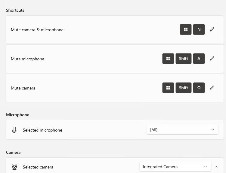
Clint Rutkas and his team have been talking about it for months. I’ve been waiting to check it out myself. That’s right: in its latest release, PowerToys v0.49.0 gets video conference mute capability. Right now it’s available through GitHub, though I expect it’s just a matter of time before it comes via the Microsoft Store. The new control page in settings serves as the lead-in graphic for this story.

What PowerToys v0.49.0 Gets Video Conference Mute Means

I run at least 4 different video conferencing platforms regularly: Zoom, Teams, Blue Jeans, and Google Meet. From time to time, I’ll get invited to another, similar platform for online meetings. Each of them offers a mute capability, but each one uses a different control in a different place in its app window.

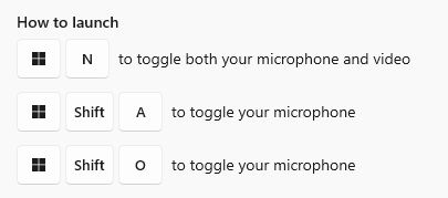
What I like about Video Conference Mute in PowerToys is that it offers one single set of controls for mike and camera, for all such apps. Here’s the set of keystrokes it uses:

PowerToys v0.49.0 Gets Video Conference Mute.keys

Keys to toggle the mike and video together, or separately. Good stuff! (Source: PowerToys built-in Welcome docs)

For those already using PowerToys, an update is in order. For those not already using the tool, you can simply run the installer and it will set you up. Then, right-click the PowerToys icon in the notification area to open its UI, and go to the VCM pane. There you simply need to move the slider labeled “Enable Video Conference Mute” to on (as shown in the lead-in graphic if you exercise the option to view it on its own web page). It’s just that easy. I already liked PowerToys a lot, but this latest and long-anticipated addition just made me like it a whole bunch more. Check it out.

Facebooklinkedin
Facebooklinkedin

Start11 Gets v0.9 Update

Some running Windows 11 who might want an alternative to the native Start Menu. For those folks, Stardock’s latest Start11 release offers a nice option. Please understand this is NOT free software. Those upgrading a Start10 license must pay US$4 for the bits; first-time buyers must pony up US$5. Either way, it’s a pretty good deal IMO. As a long-time user, when Start 11 gets v0.9 update, I pay attention. Others may not be so inclined.

When  Start 11 gets v0.9 update, What Do You Get?

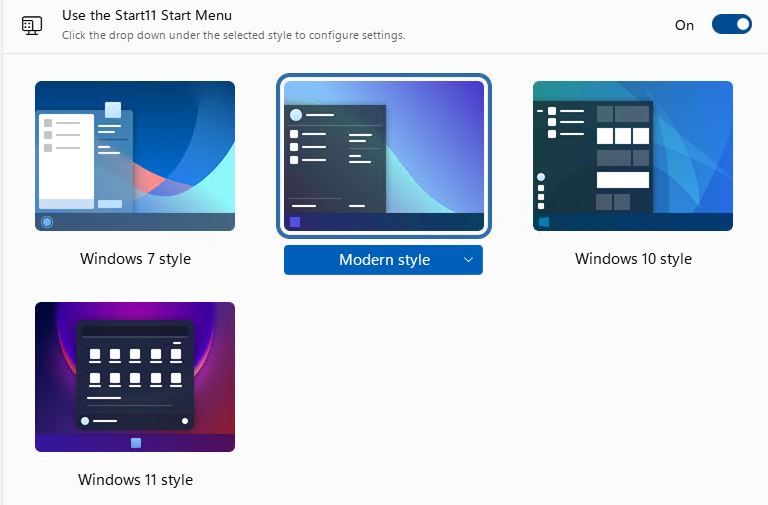
Start11 gives users a pretty broad range of functions for a small price. It allows them to make the Start Menu look like the ones from Windows 7, 8 or 10 (and of course, 11 as well). Here’s the UI “pick a version/layout” control:

Start11 Gets v0.9 Update.sm-style

You can pick from Windows 7, 8 (Modern style), 10, and 11 styles for the Start Menu layout, look, and feel.

You can pick an icon for the start button, and position the start button at left or center in the taskbar (or even up top). As for the taskbar itself, Start 11 offers a number of controls, including blur, transparency and color; the ability to apply a custom texture; right-click menu controls (which bring back the old Windows 10 style right-click pop up), and a bunch of tweaks for taskbar size and position, plus separate positioning controls for primary and secondary monitors. I like it, myself.

Search can be tweaked in a variety of ways, including disabling built-in search. Search result filtering can use icons, search can peruse file contents and well as names, and more.

Alternate Menus Appeal to Some

I know plenty of purists who want to use only native. built-in Windows controls and utilities. I am not such a person. If you are, Start11 will have no appeal to you. But if you’ve got users who want to be productive right away and already know their way around an earlier Windows version, Start11 can be a real blessing.

Right now, I’m running one machine with native facilities only, another with Start10 on Windows 11 (it works), and this one with Start11 set to run in modern layout mode. I’m watching for issues and gotchas, and will keep readers posted. I’m glad I feel comfortable getting around Windows11 using a variety of menuing tools and techniques. I remember being baffled, bothered and bewildered when Windows 8 first came out. Thank goodness, that’s no longer an issue.

Facebooklinkedin
Facebooklinkedin

Windows 11 Gets Nifty New Paint App

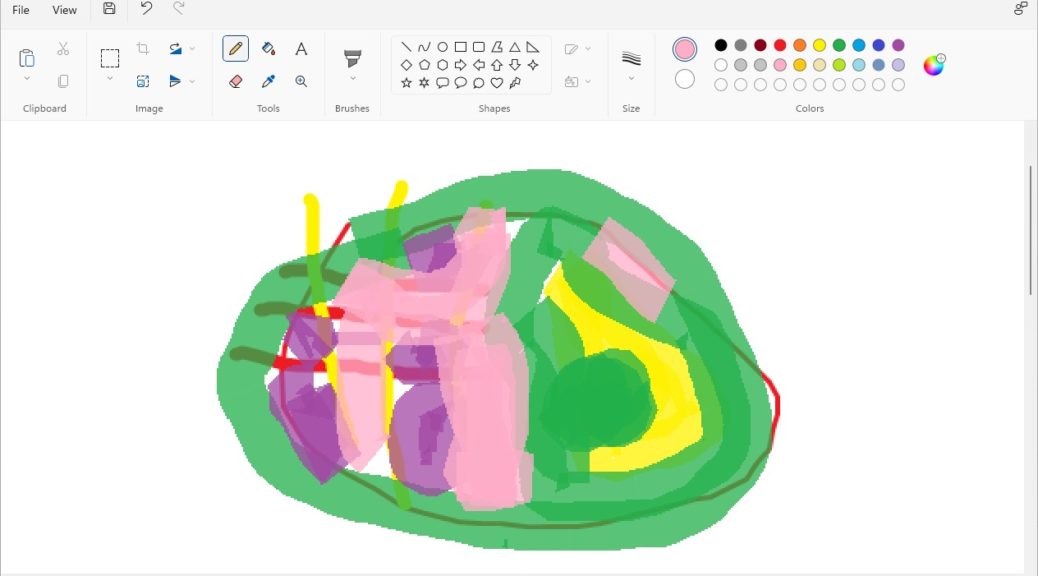
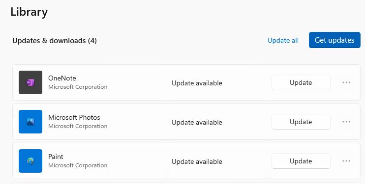
As soon as I read about it online at WinAero, I jumped into the Store to visit Library → Updates on one of my two Dev Channel PCs. And indeed, a new version of Paint awaited me there. One quick update later, and I saw for myself that Windows 11 gets nifty new paint app. My quick scrawl appears on the canvas in the lead-in graphic for this story, and the update offer in the screencap that follows.

Windows 11 Gets Nifty New Paint App.store offer

The latest Paint version gets a Windows 11 style makeover.
[Click image for full-sized view.]

MS Store Update Means Windows 11 Gets Nifty New Paint App

If you look at the lead-in graphic for the story you’ll see right away that Paint has had a thorough makeover. The top-line ribbon features new-style icons and controls. The Colors elements are all in circular — not rectangular — swatches. There’s not much new inside, except for the Text tool (upper right corner under the Tools heading). But the new iteration is cute, fun to look at, and as easy to use as ever.

Behind the scenes, though, there’s still some catching for Microsoft to do. The “Editor Colors” window remains unchanged with square outlines around basic and custom color areas.

The base app has been reworked, but the color palette hasn’t caught up yet.
[Click image for full-sized view.]

So far, it looks like the new Paint version is off to a good start. I’ll be curious to see how this unfolds as October 5 comes and goes. Some of the necessary catch-up work looks likely to come after that, based on what I see right now. But, as usual, time will tell — as will the contents of next Tuesday’s public release. Stay tuned!

Facebooklinkedin
Facebooklinkedin

Start11 Beta Arrives With Certain Complications

OK, then. Here’s a phenomenon that may interest some readers not at all, though I confess myself fascinated. When I first started using Windows 8 in February 2012, the new Start menu totally baffled me. With major deadlines close and breathing down my neck, I bought a copy of Stardock Software’s Start8 Start Menu replacement package so I could skip the learning curve and get stuff done. Since then, I’ve cheerfully paid the US$4-5 per PC that Start8 and later, Start10, licenses cost. I was immensely tickled this morning to find out that Start11 Beta arrives with certain complications in its wake. Let me explain…

What Start11 Beta Arrives With Certain Complications Means

I have licenses for Start10 on two of my three Win11 test machines. For the record, Start10 works fine on Windows 11 PCs, but it lacks native smarts and features. A for-a-fee beta version is available as of August 10. Like Start10, it goes for US$4.99. I find it a little odd to be asked to PAY to play where Beta  software is involved…

But for those with Start10 licenses, one can also pay to upgrade the software to that version and get updates as the product evolves. I qualified for a discounted (US$3.99) update price, so I ponied up and downloaded the installer file, named Start11-fs-setup_sd.exe.

Then the fun began. Because Start10 was already running, the installer informed me I had to close that program and uninstall it before I could install Start11. I killed all the Start10 related entries on the Processes tab in Task Manager.

But that proved insufficient: in fact, the Start10 service process would persistently keep restarting seconds after I killed it. So I opened the Details tab, and killed the Start10x64.exe process along with a few other hangers-on. Only then did the uninstall complete successfully, after which it informed me I had to reboot my PC to complete that process. After a restart, I was able to get Start 11 up and running.

First Impressions of Start11

I understand how the native Start Menu works in Windows 10 and 11 now, so it doesn’t bother me as it once did immediately following Windows 8’s debut. I’ll be up front and say I’m not sure Start11 is something that everybody — or even most people — need when running Windows 11. That said, as an old familiar tool for me, I immediately felt comfortable with its workings and capabilities. These include:

1. An option to shift the Start Menu button and program icons back to the left-hand side of the display.
2. Indirect access (one click to the native Start Menu through a Windows Menu button in the Start11 menu).
3. More sophisticated controls over Start Menu appearance, such as icon settings (size, background, columnar layouts), menu font controls, menu transparency controls, and customization options).
4. Right-click on Start button can be set to produce Win+X menu

Is Start11 a piece of essential Windows 11 software? Probably not. Is it nice to have? I think so, but others may disagree. I’m glad it’s cheap, but I found the install process far from smooth and well-engineered. But then, it IS a beta version. I’m guessing that will change as Start11 and the OS to which it’s matched both evolve into their production versions.

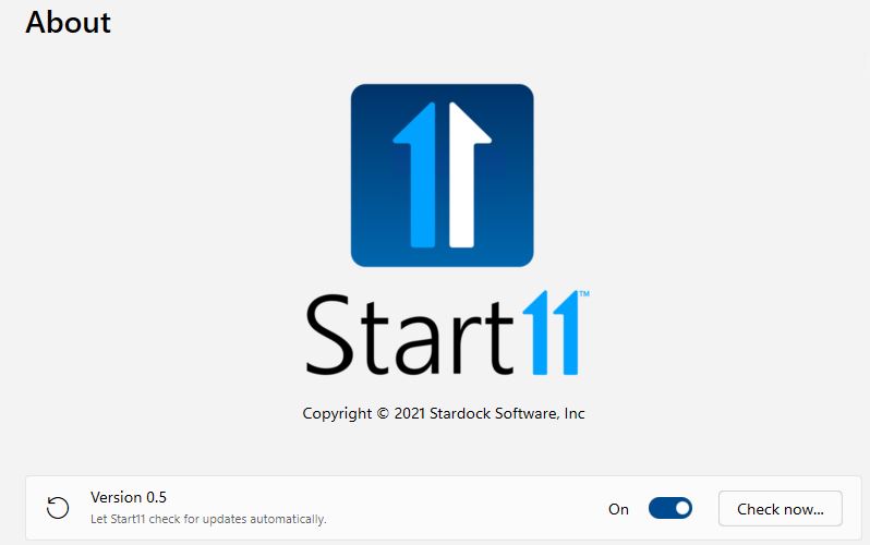
Start11 Beta Arrives With Certain Complications.about

The About screen shows Version number 0.5: a clear indication of a beta version. Hoping install will improve as the program evolves.
[Click image for full-sized view.]

Facebooklinkedin
Facebooklinkedin

Windows App Update Blues

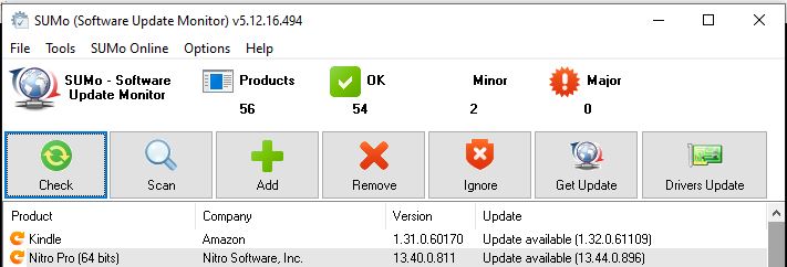
OK, then. I just got back from a nearly two-week hiatus (see yesterday’s blog post for a trip report). For the past day and a bit more, I’ve been catching up my 10 PCs. In part, that means updating the apps on those machines. Indeed, this experience has me singing the “Windows App Update Blues.” They’re nicely illustrated in the lead-in graphic for this story, which shows two apps on my primary production PC that lack built-in update facilities despite widespread proliferation and use (Kindle) and a pricey paid-for license (Nitro Pro).

Why Sing Those Low-Down Windows App Update Blues?

It’s nearly inconceivable that Amazon, that paragon of modern software efficiency and might, doesn’t include an updater for the Kindle reader. Ditto for Nitro Pro, which makes me shell out over US$100 for updates to this powerful and otherwise handy PDF tool on a more-or-less yearly basis.

Updates are not that simple on either side. For Kindle on PC, I have to visit the “free Kindle app” page at Amazon. Because I stay logged into the site, clicking “Download for PC & Mac” brings a file named KindleForPC-installer-1.32.61109.exe to my PC. Then, I have to run the installer, and it gets updated. Thankfully, this does not require me to remove the older version manually by way of post-install cleanup. Question: why can’t I get an update through the usual Help → About sequence typical for most Windows apps?

Nitro Pro has a “Visit our website” link on its Help → About pane. I guess that’s intended to streamline the manual update process. But each time I have to upgrade, I have to remember to visit the Downloads page via the website’s page footers, and manually download the latest version. While Amazon is at least kind enough to rename its updates so you can tell them apart, all four versions of Nitro pro 13 share the same filename: nitro_pro13.exe so only file creation dates distinguish them from one another. Then, something called “Nitro Pro SysTray” blocks installation until I instruct the installer to shut it down manually. After that, things work their way to proper completion. It, too, cleans up older versions (thank goodness).

But the Question Lingers: Why Manual?

I’m still not happy that I have to run this stuff down on my own and run updates manually. I hope somebody at Amazon and Nitro notices this item, and takes appropriate action. Given that most programs do this automatically, why can’t their apps do the same?


Facebooklinkedin
Facebooklinkedin