Category Archives: Updates

Stacking Restartable Updates Works OK

It’s not a crazy question. It goes something like this: should users/admins install and restart after a single Cumulative Update, or can they allow multiple such updates in series? I just tried the latter on a couple of PCs, and everything turned out OK. I believe it may take a little longer to do them one at a time anyway (because of the time delay of the “extra restart”). But recent experience strongly asserts that stacking restartable updates works OK.

If Stacking Restartable Updates Works OK, Let ’em Rip!

This time around, Windows 11 got KB50100474 (.NET Framework 3.5 and 4.8) plus KB 5010414 (CU for Windows 11 x64…). I ran the drill on my Lenovo X1 Carbon (production Windows 11) and my Lenovo X380  Yoga (Beta/Insider Preview Channel Windows 11). Both got to the desktop through the reboot process in under 2 minutes. In my experience with various updates, that’s pretty fast in general for any single CU let alone 2 of them together.

Running DISM’s start component analyze and cleanup functions afterward, I found 2 reclaimable packages resulted from the updates. Cleaning them up regained affected PCs about 1.93 GB of disk space in the component store. It took about 8 minutes to complete. Worth doing, for sure!

Note: Don’t be disturbed by the “double progress bars” (see next screencap) for the /startcomponentcleanup bit. That always happens unless you reboot the PC before running this command after applying an update.

After stacking two CUs it’s no surprise that 2 reclaimable packages show up in DISM analysis of the component store.

I must say MS has Windows 11 working pretty well of late. I have yet to experience anything serious in the update/maintenance department since last October, when the official release emerged into public view. Good stuff!

Facebooklinkedin
Facebooklinkedin

New Ventoy 1.0.66 Version Available

Thanks to Martin Brinkmann at Ghacks.net, I just learned there’s a new Ventoy 1.0.66 version available. Among other cool features, it now supports an “experimental” (beta) feature to boot most supported image formats from a local disk. Check out the GitHub page and its  documentation page at Ventoy.net for a complete recitation.

With New Ventoy 1.0.66 Version Available, Grab One!

I’ve been writing about Ventoy since April 2020, when I first learned about this outstanding tool. Here’s my first-ever Ventoy item: Bootable USB Tool Ventoy (Win10.Guru). The Ventoy,net site has long since overcome its initial underprovisioning issues. Indeed, the tool is now available through both GitHub and SourceForge as well. It’s also added lots of bells and whistles along the way.

If you don’t already know and use this tool, you owe it to yourself to check it out. Be sure to check out the many content items on the Ventoy Document page for news, how-tos, explainers, and information about the tool’s growing collection of interesting plug-ins.

Make Ventoy Your Go-To Install/Repair Tool

Right now, I’m still using a 256GB SSD in a Sabrent NVMe drive caddy (USB 3.2 Gen 2) for my collection of tools and images. I have 29 images on the drive, which include many versions of Windows 10 and 11, plus the Microsoft Diagnostics and Recovery Toolset (DaRT), the MacriumRescue ISO, BOOTPE.iso, various memtest utilities, and more.  I’ve still got 94 GB of disk space free on the drive and will no doubt keep adding to it over time.

It’s a great tool: worth downloading, using, and updating as needed. Cheers!


Facebooklinkedin
Facebooklinkedin

PowerToys 55.2 Fixes Things Up

If you read this blog regularly, you may be aware that in early January I reported about a fix for a strange Zoom issue. Seems that for some odd reason, the Mute Video Conference feature in PowerToys when enabled clobbers Zoom. Turn it off in PowerToys, and it works again. A workable, if not entirely satisfactory, repair. I’m pleased to report that PowerToys 55.2 fixes things up. I have a feeling it’s .NET related and comes thanks to the tool collections update to the .NET 6 framework and so forth.

But hey! I’ve been busy for the past two weeks. Cliff Rutkas and his team could’ve slipped an earlier fix past me. Be that as it may, I can now use both the Video Conference Mute feature in PT55.2 *and* Zoom on the same PC. Good-oh!

PowerToys 55.2 Fixes Things Up . . . and More!

While I’m on the subject of PT (any version) I’d like to extend my further thanks and appreciation to that team for the work they’ve done on the toolset lately. Installation has become much more routine. There’s been no need to stop mid-way through the initial “turn off old components” section lately, jump into Task Manager, and kill stuff before the installer can proceed. Instead, the process sails through to completion without human intervention — just the way I like it!

This tool is definitely gaining polish and capability. I had already liked it quite a bit. Now I like it even more. If you’re not familiar with PT be sure to check out (and read over) its documentation. It will definitely clue you in, and get you going with this terrific Windows toybox full of handy little tools.

Facebooklinkedin
Facebooklinkedin

WU Update Connectivity 8 Hours vs Minutes

OK, so it’s “Patch Tuesday” once again. I’m updating my fleet of 10 PCs. I’ve got one eye on the clock and the other on a recent article from WindowsLatest. It’s entitled Microsoft: Windows 10, Windows 11 need eight hours online to deploy updates. As I update my various Windows 10 and 11 PCs I’m seeing times in minutes, not hours. Why assert WU update connectivity 8 hours vs minutes?

Why Is WU Update Connectivity 8 Hours?

As I’m timing my various machines, the X1 Carbon took about 7 minutes to handle the updates from start to finish. My production desktop is at 11 minutes and counting. What does the story say? Here’s the most salient quote (emphasis mine):

Your device should be online for at least eight hours to process Windows cumulative or feature updates properly. This period is called ‘Update Connectivity’ and eight hours is necessary to get the latest updates from Microsoft’s servers and successfully install them.

I can only understand this one way. This is the interval that’s needed when the user doesn’t initiate updates. It sure doesn’t take that long when one requests an update from WU. My production PC (i7-6700) took 15 minutes to get to the “Restart required” notification. Prior experience says it will take another 5 minutes, max to the desktop. So why 8 hours? It gets more interesting, as recited next…

More Interesting Quotes

“The Update Connectivity period includes a minimum of two continuous connected hours and six total connected hours after an update is available for download.

Specifically, data shows that devices need a minimum of two continuous connected hours, and six total connected hours after an update is released to reliably update. “This allows for a successful download and background installations that are able to restart or resume once a device is active and connected,” Microsoft noted in a new blog post.

What does this mean?

It means it’s best to leave PCs connected to the Internet when the Internet is the source of updates for those selfsame PCs. Those who use their own servers to push updates (or other means of update distribution) won’t be subject to the same limitations. Fascinating, though: who knew?

Facebooklinkedin
Facebooklinkedin

Another Missed Windows 11 Experience Update?

Last Thursday (Jan 27) I wrote about speculations that upcoming updates planned for February might come as an “Experience Pack.” Over the weekend,  Paul Thurrott opined on another missed Windows 11 Experience update. Preview Update for Windows 11 (KB5008353) includes settings changes for the logged-in Windows user’s account. It’s called “Your Microsoft Account.”

What Makes This Another Missed Windows 11 Experience Update?

In his story, Thurrott observes — and quotes from — an October 2021 announcement. Therein, MS promised changes for “Your Microsoft Account” in Settings.  They would arrive via upcoming Online Service Experience Packs. Ha! Not happening yet, apparently. The first such change appeared in KB5008353 on January 25 in a conventional CU.

But it’s just a small incremental change. Other changes should follow. Perhaps one of them might will arrive in an Experience Pack? In the MS October item, the newly reworked YMA looks like this (mine is the lead-in graphic for this story):

Another Missed Windows 11 Experience Update.promised

Here’s what MS promised in October; what I see on my test PC appears as the lead graphic above [Click to see full-sized].

Yet Again, I’m Not an Early Arriver

This may be another gradual feature rollout. And apparently, I’m not in the first group of recipients. My “Your Microsoft Account” still remains unchanged. Aside from being unsurprised, I’m curious to see how long it takes for the new feature to make its way into general distribution. Stay tuned: I’ll keep you posted.

And remember, there’s always something odd or interesting going on here in Windows World. This is the kind of thing that keeps me intrigued and engaged. Thus: never a dull moment here at Chez Tittel. Thanks also to Mr. Thurrott for bringing this missed opportunity to my attention. Good stuff!

Facebooklinkedin
Facebooklinkedin

No 22533 Dev Channel Flyouts Here … Unless You Push the Right Physical Button

The latest Dev Channel version of Windows 11 showed up on my test PCs yesterday. That means I was slow on the uptake: its announcement blog is dated January 12 (Tuesday). Be that as it may, that blog post claims that “new flyouts [for volume, brightness, and more] will appear when you press the volume or brightness keys on your laptop.” Alas, I see no 22533 Dev Channel flyouts here on either of my test machines. Instead, I see only the same old “flyout panel at right” shown below. The “new look” appears as the lead-in graphic for this story, courtesy of the afore-linked 22533 announcement.

No 22533 Dev Channel Flyouts Here.old-flyout

Alas, I’m still stuck on the old response to clicking the volume icon in taskbar.

If No 22533 Dev Channel Flyouts Here, Then What?

Wait and hope for this to show up on my machines, I guess. MS doesn’t specifically SAY this is a gradual rollout. But the absence of this feature on both PCs certainly suggests that’s the case. I have to laugh: once again I’m on the slow end of the rollout as a nifty new feature shows up. I guess I should be grateful MS shared an image of what I would be able to see, were I lucky enough to have this capability on my own test PCs. All and I can say is, sigh, and sigh again.

That’s the way things go sometimes, here in Windows-World. This is neither the first time I’ve been left out of a gradual rollout — if indeed that’s what it is. And I’m pretty sure it won’t be the last time, either. I’m curious to see what kind of response my experience will engender when I post this info to the WIMVP Teams channel. Maybe I’m doing something wrong, and there’ll be an easy fix. If so, count on me to report back. In the meantime, stay tuned!

The Fix Is In: Push the Physical Button, Doofus!

I heard back pretty much immediately from Brandon LeBlanc on the Insider Team. Seems this flyout REQUIRES a physical corresponding button (volume, brightness, etc) on the PC in use. And presto (pun intended), as soon as I did that, it worked. So much for my “hurt feelings” at not being included. I just had to push the right button and it worked right away. Go figure — and while you’re doing that, indulge in a chuckle at my expense. It was all there in black and white: I just misunderstood.

Facebooklinkedin
Facebooklinkedin

Version 1.1 Brings Start11 Way Up

When Windows 8 arrived in 2012 — a decade ago, now — I was nonplussed and flabbergasted. The new menus completely threw me for a loop. I had trouble finding my own desktop and its assets. Then I discovered Stardock’s Start8, which let me use everything I knew about Windows 7 to interact with Windows 8. It was a lifesaver. By the time Windows 10 came along, I naturally gravitated to Start10 out of habit, if for no other reason. With Windows 11, early versions of — you guessed it — Start11 had me wondering why I bothered with the program. Even for a mere US$5 ($4 to upgrade) it didn’t seem to add much to the native experience. But version 1.1 brings Start11 way up in terms of functionality, and provides one-click access to otherwise more complex native operations. Let me explain…

If Version 1.1 Brings Start11 Way Up, What Do You Get?

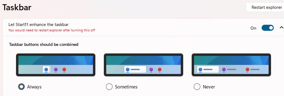
Take a look at the lead-in screencap. IT shows the right-click taskbar pop-up (lower right) along with the Start11 settings pane that makes it happen. The key item is “Replace taskbar right click menu with Windows 10 style one.” That change confers the following options:

  • Configure Start11…: provides instant access to the Start11 app (previous versions needed a launch from the Start menu)
  • Cascade windows/Show windows stacked/Show windows side by side: manage on-desk arrangement of open Windows
  • Show the desktop: hide all open Windows
  • Task Manager: one-click access to the Task Manager
  • Taskbar settings: one-click access to Taskbar settings

For me the biggies are easier access to Start11 controls and familiar access to Task Manager. Does this mean I’m turning into a hide-bound dinosaur, set in my ways? Probably. I had been using CTRL-ALT-ESC to fire off Taskbar before and this is less work.

Other taskbar tweaks are nice, too. They include changing its size and position (but top or bottom alignment only, no right or left side).

Worth the Price of Admission?

Sure, Start11 is cheap. But I’ve learned a lot since Windows 8 hit the streets a decade ago and more. I’m not uncomfortable in the native Windows 10 Start menu , and ditto for Windows 11. I’ve got several test machines running 11 with no “menu support” of any kind and am just as productive there as on an assisted alternative desktop.

I’ll probably buy a license for Start11 when I upgrade my wife’s 11th-gen Dell Micro 7080 later this year. She will be able to keep working as she always has, with little difference between how her system now works on Windows 10 and how it will work post-upgrade. But outside those who resist, or don’t like, change, I don’t see Start11 as a must-have piece of software any longer.

Does that mean Microsoft has gotten better at building base level OS navigation? Or does it mean that I’ve simply absorbed the start menu ethos within Windows 10 and 11? A little of both, I suspect.

Bottom line: If you’re already using Start 11, the 1.1 upgrade really makes the program shine (and more usable and capable). If that means you, grab the upgrade today!


Facebooklinkedin
Facebooklinkedin

2022 Gets First Windows 10 WUCU Woohoo

I can’t help it. I have to have fun with my headlines occasionally. In this case, WUCU refers to a Cumulative Update (CU) delivered via Windows Update (WU). Hence my proclamation, as 2022 gets first Windows 10 WUCU. The woohoo part is just for grins. I was busy enough with writing and phone calls yesterday that I didn’t notice the download and install part. But when I logged in this morning, I saw a notification that led me to the “Restart required” message in WU. It’s present on all the “regular PCs” in my fleet (those not running an Insider Preview).

When 2022 Gets First Windows 10 WUCU, Then What?

Why, restart all those machines, of course. I just checked the Windows 11 PCs, and they don’t seem to be queued up for Patch Tuesday action. I wonder if this is just a one-off, or if the update cadence for the newest desktop OS might be changing. I guess I’ll have to keep an eye on things, to see what happens.

Closer investigation shows that KB 5009566 hit Windows 11 machines yesterday (January 11) as well. It’s labeled as a Quality Update in Update History, not a CU. So it looks like the cadence continues as always, but that the labels attached to the Patch Tuesday update can be either QU or CU depending on their contents and recent prior preview update activity. Good to know!

Here’s what that looks like on my production-level Lenovo X1 Extreme (8th-gen Intel CPU, vintage 2018).

The update for Windows 11 also arrived on January 11, but it’s a QU not a CU. Go figure!

It seems that Windows 11 is finally starting to diverge from Windows 10. I think we may see some exciting new developments and capabilities in the run-up to this fall’s upcoming equivalent to a feature update. Should be interesting. Stay tuned: I’ll keep you posted.

Facebooklinkedin
Facebooklinkedin

Beta Channel Gets Redesigned NotePad

Woo hoo! FINALLY, MS announces it “begins rolling” something out and I get a copy.  As the Windows 11 Beta Channel gets redesigned NotePad, it shows up in my MS Store updates this morning. The app itself appears in the lead-in graphic. Just below, see the tweet to @WindowsInsider that announced this “all Windows Insiders” release.

Beta Channel Gets Redesigned NotePad (Tweet)

If Beta Channel Gets Redesigned NotePad, Then What?

The new version of Notepad shows up in the Start menu as an app. This is different from the notepad.exe version that’s still available in %Windir%\System32 by default. You can see the difference in the title bar for the app in the lead-in graphic: it includes the word PREVIEW in all caps. Of course, this version supports the “dark theme,” whose enabled setting also appears in that same screencap as well.

Because I’ve so often been on the outside looking in when MS announces an app or feature in rollout mode, it’s wildly exciting to get in on this first thing. Of course, Brandon LeBlanc’s tweet does say that this rollout includes “all Windows Insiders in the Beta Channel.” So I expected to see it, and indeed, it showed up.

Does that make me any kind of special? Nah, but it’s still exciting anyway. That said, except for the dark theme, and a reworked and more visually effective font manager, I don’t see any differences between the exe and app versions of Notepad just yet. But they’re bound to appear, so stay tuned.

In the meantime, I’ll just revel in the chance to play with my new toy along with everybody else, thanks. Cheers! The concluding screencap shows how the app version of Notepad appears in the Start menu, just for grins…

Beta Channel Gets Redesigned NotePad.start-info

The new app version labels itself as such in the Windows 11 Start menu, as you can see.

Facebooklinkedin
Facebooklinkedin

Windows 11 22518 Gets Spotlight Background

Microsoft Spotlight is a stunning collection of high-resolution, high-impact photographs. The company has long used them for its lockscreen images. Starting with Build 22518 (Dev Channel), users can elect Spotlight images for desktop backgrounds. That’s what “Windows 11 22518 gets Spotlight background” means. To learn more , see “Configure Windows Spotlight on the lock screen.”

If Windows 11 22518 Gets Spotlight Background, Then What?

Starting in Build 22518, Windows 11 offers Spotlight collection as an option for “Personalize your background.” To access this item, right-click the desktop on a Windows 11 PC (Build 22518 or higher). Then, click the carat at the right of “Personalize your background.”

As you can see in the lead-in graphic for this story, that produces a menu of background image/color options. They now include “Spotlight collection” (at bottom). Choose that option and your desktop background will come from a collection of amazing images.

Confusion Sometimes Foils Rapid Reporting

At first, I could not find the Spotlight collection option as described. Only gradually did I realize it was my fault. Seems that while I had applied the 22518 update to my Dev Channel PCs, they hadn’t yet been restarted. Can’t get to a new version or build without a restart. Amusingly, operator error reared its frustrating and fulsome head.

But once I was running the right Dev Channel version, everything worked as described here. I have to laugh at myself for missing an obvious boat. But that’s the way things sometimes go here in Windows World. Before you can run, you must be able to walk…

Facebooklinkedin
Facebooklinkedin