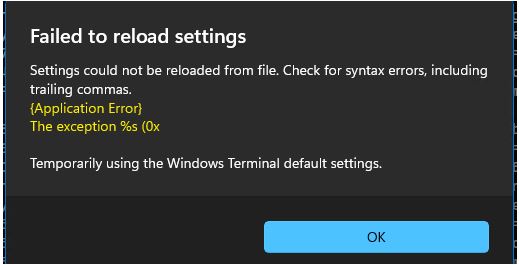
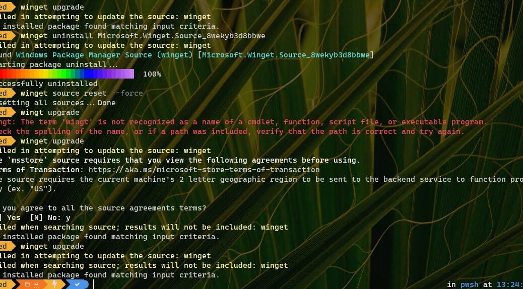
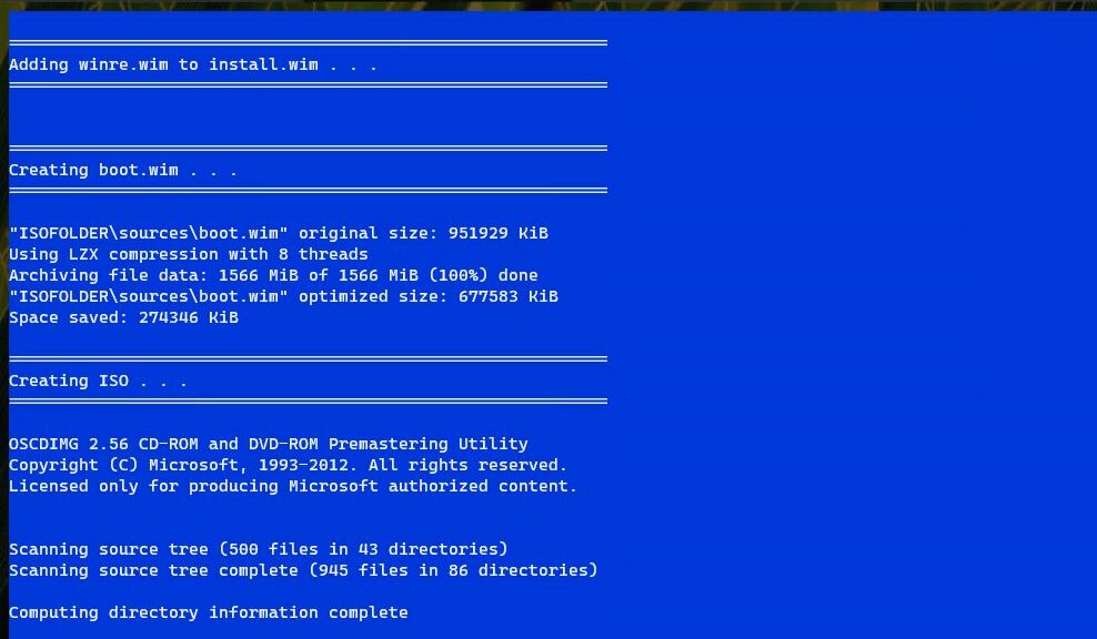
I’ve just completed a fascinating project for TekkiGurus: a five-part series on customizing and extending Windows Terminal. For the 5th and final part, I decided to build PowerShell scripting that would handle such customizations I use as don’t fall under the settings.json umbrella. Ironically, one of those tasks involved editing that very file to change the default font. That’s when I saw syntax erors derail PowerShell JSON edits, as shown in the lead-in graphic. Let me explain…
How Did Syntax Errors Derail PowerShell JSON Edits?
I started off my project by asking Copilot to present me with some initial PowerShell commands to handle the following tasks:
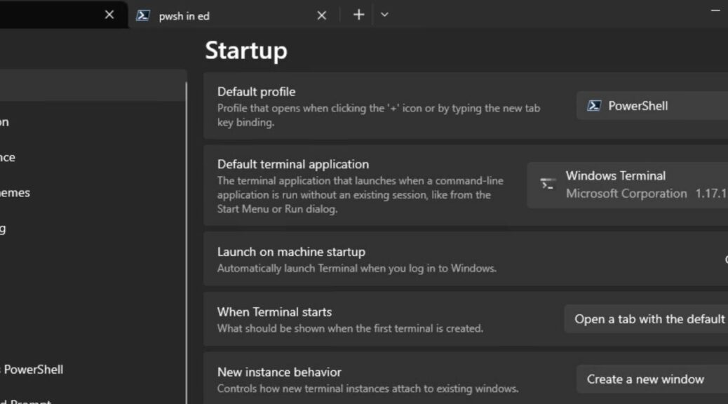
1. Download, install and set up Jan DeDobbeleer’s outstanding OhMyPosh prompt customization tool. This turns out to be a more complex task than it might seem, because it requires downloading, unzipping and copying Nerd Fonts into C:\Windows\Fonts, adding an invocation to the PowerShell Profile script, dealing with OhMyPosh, and then selecting a Nerd Font as the WT default.
2. Download, install and add the colortool executable to a default Windows path. Colortool is a GitHub project that provides information about Windows Terminal color assignments for text and text backgrounds. This one was pretty straightforward.
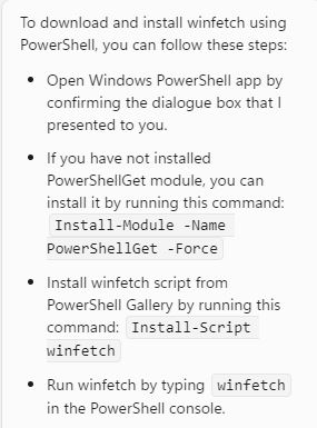
3. Install the winfetch utility that shows WT color schemes, system info, text colors, and a few other odds’n’ends. This required only one line of code, so easy-peasey.
The error showed up at the end of my PS sequence for the OhMyPosh tasks (I’ll refer to this as OMP from now on). Seems that Copilot’s code included two errors that it took me some time to find. First, the object sequence for the default font that OMP required turned out to be the string “.profiles.defaults.font.face” rather than the truncated version that Copilot provided (“.profiles.defaults.font”). Also, it used an alias for the default Nerd Font I chose rather than its full name — that is “CaskaydiaCove NF” instead of “CaskaydiaCove Nerd Font”. Interestingly, this alias worked in Windows 10, but not in Windows 11 (there, only the full name would do).
Errors Found Are Easily Fixed
It took me a while to figure this out because I couldn’t find exact documentation to match my problems precisely. I figured out the object sequence by examining the json.settings file from another Windows PC that had the default already set and following the sequence of the object name hierarchy in use in that file. In other words, I noticed a face property in that file that was missing from my rewritten json.settings file. No wonder it wouldn’t save.
Once I made that change, I got another error message (from Windows 11) that reported it couldn’t find a font named “CaskaydiaCove NF.” I so looked in C:\Windows\Fonts, and sure enough the font name in Explorer is actually “CaskaydiaCove Nerd Font.” And again, once I made that change things worked properly.
As the old saying goes: “It’s always easy when you know how.” It took me a while to get to the last detail in the “how” part, but indeed, it was dead easy after that. Things go that way a lot in Windows-World, especially when writing code or command line instructions. I’m just glad it’s working now!
One More Thing: Replacing Munged JSON File
On the machine where I made the object reference error, settings.json remained munged. It kept throwing errors each time I started up WT or PowerShell. So I researched the topic and learned that if you open settings.json in a text editor, then delete the whole thing, WT will rebuild that file from programmed defaults when an empty file gets saved. That put my WT and PowerShell environments back to rights, and I was then able to get the corrected script to run to completion on that PC.
I’ll observe that if you’re going to edit settings.json in PowerShell on a Windows PC, it’s a good idea to have a backup at hand to replace that file. I’m learning that it’s kind of like working on the registry, where changes can have even more serious and dire side effects. Cheers!
