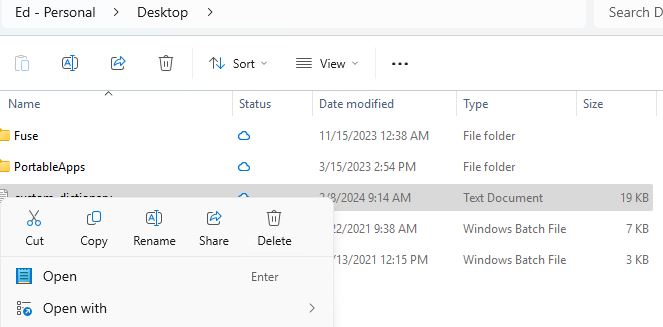
It’s a small change but a helpful one. In Canary Channel Build 26058 Explorer brings button labels back. That is, instead of simply showing labels and forcing you to do one of these:
- Remember what they are and what they do
- Mouse over the label icon and read the text tip
- Pick one and hope for the best
Explorer once again shows text to accompany the icons so users know what they’re doing. These show up at middle in the lead-in graphic, with icon buttons above and text below. To wit: Scissors button/Cut, overlaid pages/Copy, Text “A”/Rename, Block with pointer/Share, and Trashcan/Delete. Good stuff!
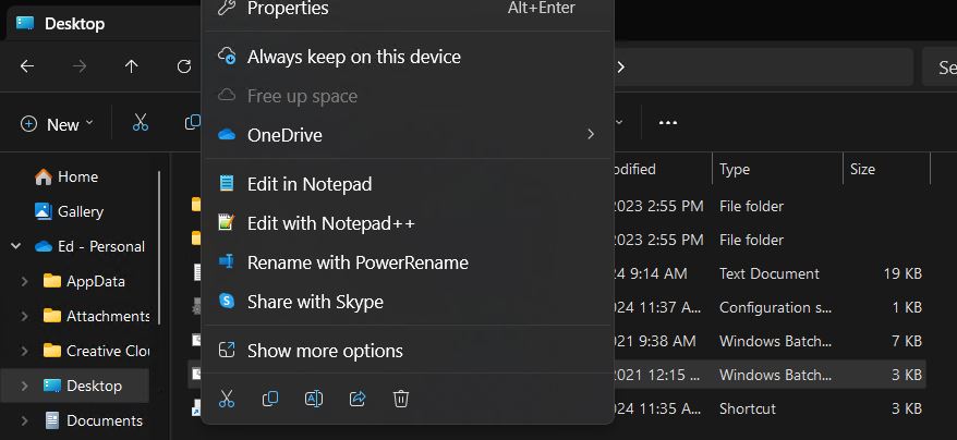
You can see what the old way looks like in the production Windows version (Build 22631) below where the icons appear at the bottom of the Explorer right-click context menu for files inside a folder. Much less intelligible, IMO.
Notice the line of icons at the bottom of the content menu. Mouseover will show tip text.
Rejoice When Build 26058 Explorer Brings Button Labels Back
It’s not a huge change to see text show up with a button, unprompted. But it is a comforting usability improvement. I’d always wondered why MS adopted this ultra-compact approach. But given the presence of tip text on mouseover, I’d always been able to suss things out if I wasn’t 100% what was what.
This latest improvement saves the time and effort involved in mousing over. I definitely appreciate it. On the one hand: thanks! On the other: Why’d it take so long?
And if those aren’t among the major dueling dualities here in Windows-World, I haven’t been paying attention for the past 30-plus years. Yeah, right…

