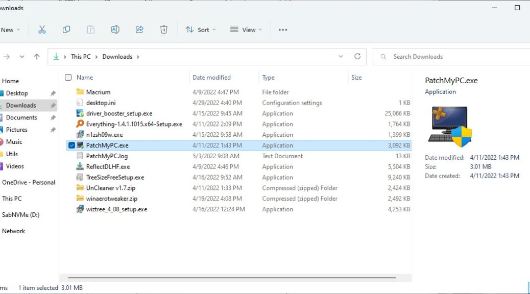
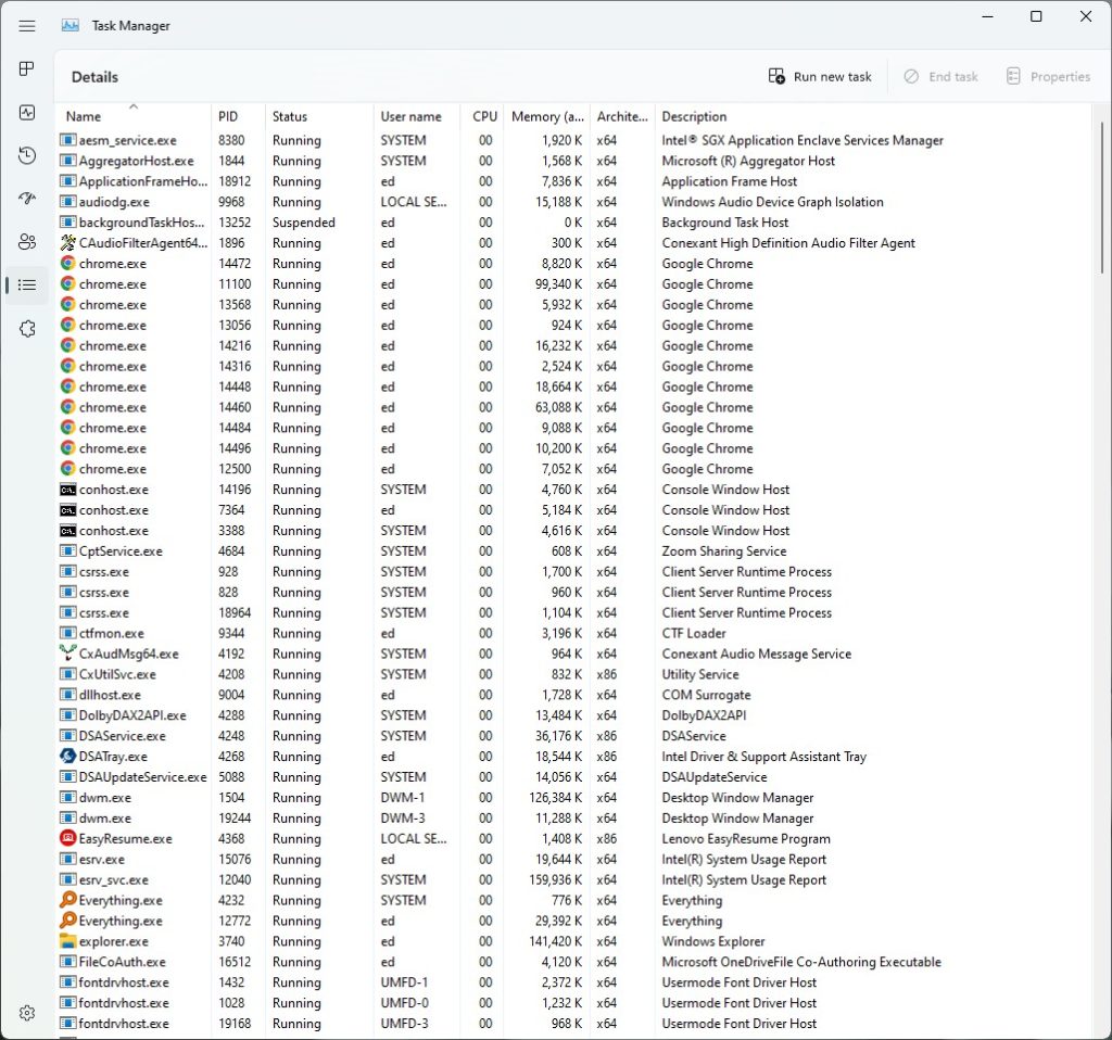
Very interesting. I’ve taken some time to explore and play with the latest Dev Channel build. Mostly notably Build 22610 brings Explorer TaskMgr changes to look and feel. You can see this pretty strongly in the Explorer screencap above, and in the Task Manager screencap that follows.
Task Manager gets a cleaner, less cluttered look (Details view on display), but… [Click image for full-sized view.]
Build 22610 Brings Explorer TaskMgr Changes Explored
On the Explorer side of things, I see no toolbar ribbon in a sparser toolbar overall. Mouseover pop-ups require clicking a menu item before they’ll appear (I’m almost fluent in the new iconography, but occasionally need a reminder). The new look of the Details pane (far right) is pretty neat, IMO: I like the look and layout. That makes me more inclined to use it. Check out the new thumbnails view for a LOT more of the same kind of thing, too (icon at far lower right).
Switching over to Task Manager, the same sparse and spare look also comes into play . Navigation switches from a tab bar at the top to left nav icons. Again, I’m going to have to master the iconography, but mouseover pop-ups appear without doing anything to prompt them. There’s a new “Efficiency mode” right-click item on the Details pane that lowers power allocation and warns of potential resulting instability. Could be good for laptop/tablet users runnning on battery. Lots of interesting changes so far. I need to explore further and learn more before I feel like I really understand all the differences. That should be fun!
Net-Net Nut
Overall, I’m liking what I’m seeing quite a bit. I’m coming to prefer the look, feel and behavior of Windows 11 over Windows 10. It’s been slow but steady coming on. These latest changes make the newer OS more compelling, visually, and two of its most common and important tools a little easier to work in and use. As far as I’m concerned, I give the latest version two solid thumbs up!

