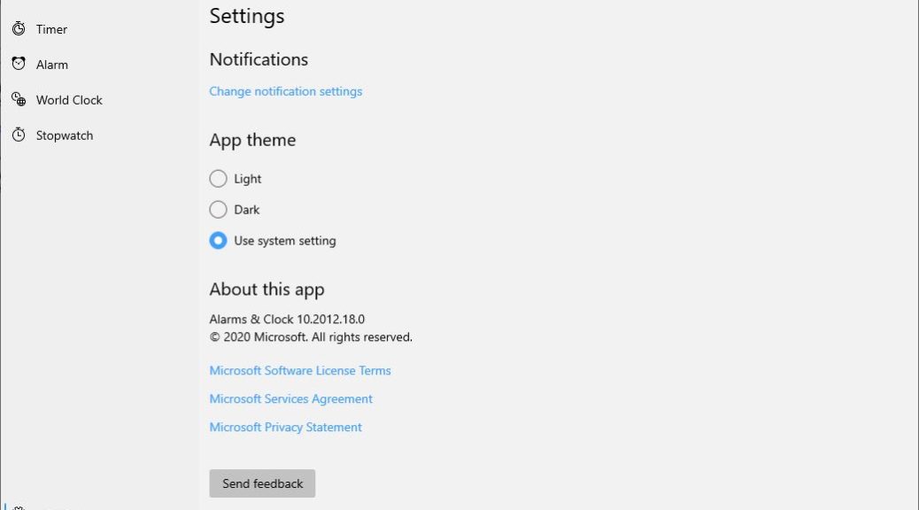
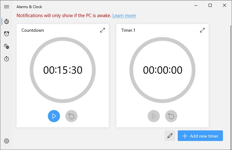
Both forks of the Dev Channel builds offer a look into Windows 10’s UI future. I’ve just checked, and those who upgrade the Alarms & Clock app through the Store to version 10.2012.18.0 will see the new look. According to Mayank Parmar at WindowsLatest, the new rounded interface, look and feel represents the direction toward which 21H2 UI design is trending. He says this is “part of a major overhaul codenamed ‘Sun Valley’” possibly to go public in the second half of next year. Hence my assertion that Dev Channel previews offer Sun Valley sneak peek. Check it out!
Note the rounded look for the progress bars and the completely changed UI look and feel.
[Click image for full-sized view.]
Dev Channel Previews Offer Sun Valley Sneak Peek Explained
There’s some reading between the lines required to suss out what’s going on. MS has been moving the UI toward what Parmar correctly identifies as a “modern” and “rounded” look of late, especially in its icon designs and the Start Menu layout and visuals. Now it looks like Settings is coming in for similar treatment. He and other Windows watchers suggest — and I concur, based on eyeballing things for myself — that this is something real, if still only narrowly visible.
Overall, I think it’s a good look for Windows 10. And it certainly shows the influence of clean, simple designs and visuals that is bleeding over from the smartphone world onto the desktop. But with users ever more inclined to switch between mobile and desktop views of their apps and data, this has to be a good thing.
I’m curious to see how quickly Microsoft will start rolling this into other Settings facilities. Beyond that, I’m wondering if this will continue to show up in 202XX and 212XX Dev Channel builds. If it targets 21H2 and 212XX is its associated release/build family, it makes sense to me that these changes may focus there. I guess we’ll just have to wait and see, because so far MS isn’t saying much about what separates the two release families.

